Our brand and identity
Five colors. One story called Puerto Plata.
Our identity did not begin with a random palette. Every shade comes from the landscape, history and places that make the Bride of the Atlantic unique.

We want our brand to feel like the destination it represents: Atlantic, natural, luminous, historic and filled with places that surprise you.
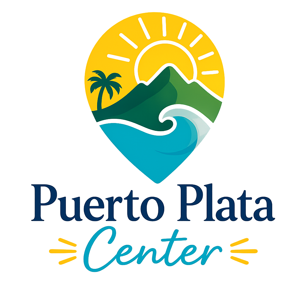
Our symbol
A province between mountain and sea.
Our secondary mark brings together some of the elements that define Puerto Plata: the lighthouse and its history, Mount Isabel de Torres, coastal palms, the Caribbean sun and the waters of the Atlantic. It is a visual summary of the place we want to help people discover.
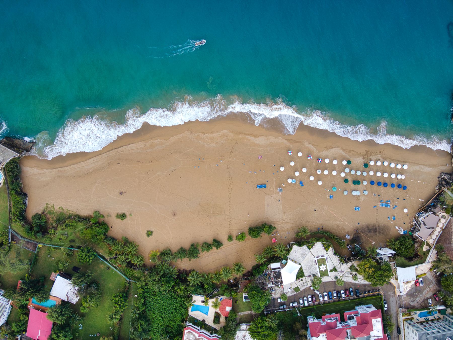
Atlantic Blue
It is the color of the Atlantic Ocean and the open sky of the North Coast. Blue expresses the scale, freshness and trust with which we want to welcome every visitor.
It is the primary color of our identity, guiding navigation, links and the moments with the strongest brand recognition.
#056B9F
Isabel de Torres Green
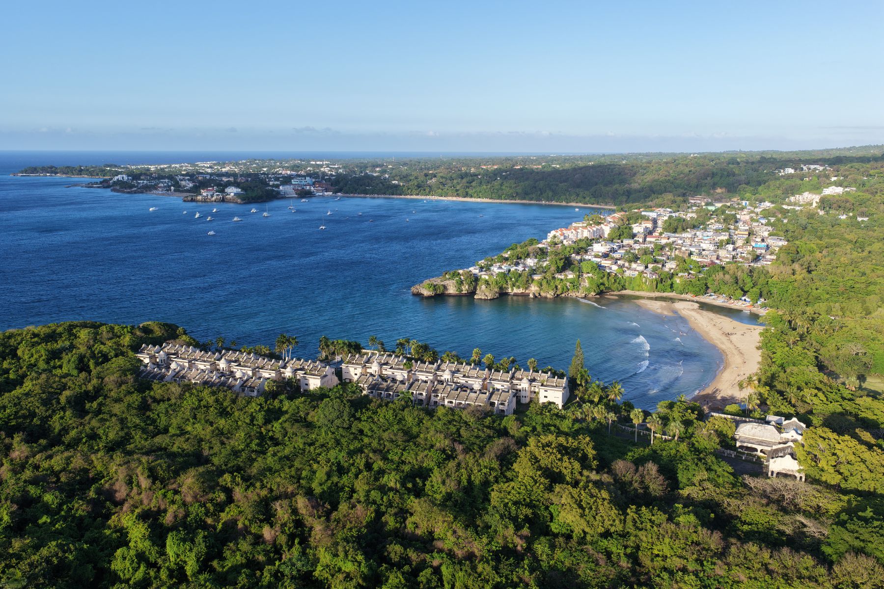
It lives in Mount Isabel de Torres and the tropical vegetation surrounding Puerto Plata. It represents a province that is alive, fertile and always connected to nature.
We use it to communicate growth, trust, outdoor experiences and actions that bring people closer to the local community.
#357A49
Monte de Plata Silver
Christopher Columbus called this mountain Monte de Plata after seeing the clouds make its summit shine. That image gave rise to the name that still identifies our province.
It is our neutral: bringing calm, clarity and space so photography and the other colors have room to breathe.
#C8D0D5
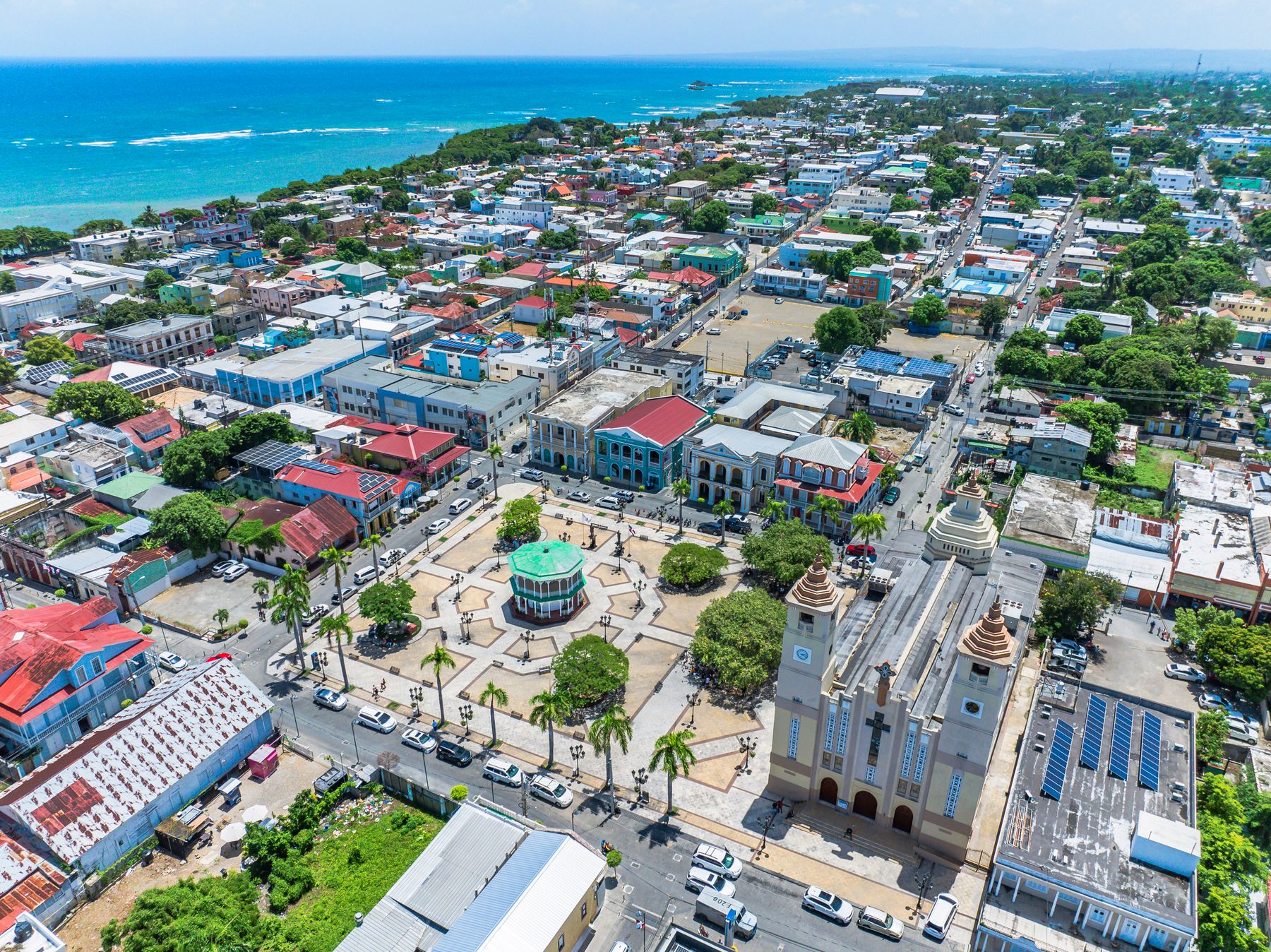
 Photo by Aneudy Caceres · Pexels
Amber Yellow
Dominican amber is a fossilized resin known for its clarity and rich tones. In Puerto Plata, it is part of our history, our museums and our cultural identity.
It brings light and warmth, highlighting important ideas, editorial details and moments we want people to remember.
#E3AD37
Doña Blanca Pink
It is the shade of Paseo de Doña Blanca, the pink pedestrian alley in the historic center that has become one of Puerto Plata's most photographed places.
It is our most expressive accent: human, joyful and unexpected. We reserve it to give special details a distinctive personality.
#D8849D
Five shades that could only belong to Puerto Plata.
Together they form a recognizable, local and flexible identity: a brand created to guide, connect and celebrate everything that makes our province special.
Back to Puerto Plata Center→